
Behind the Scenes: Graphic Pixel Art
Exploring a watercolor look in BlenderAnalyzing the Material
Now that I had a model, I took a closer look at some watercolor paintings by Alex Hillkurtz and I tried to break it down into some characteristics that I could then try and replicate in 3D.
- First thing I noticed was the paper texture. It plays an active and important role in achieving a watercolor painting look. We can achieve that look quite easily in 3D – all we need to do is use a paper texture and overlay it in our background and material.
- Then I noticed the sketchy ink outline. We can also achieve that quite easily by using Blender’s Freestyle render engine.
- Next, I started to look at the watercolor paint itself. The colors have a very organic way of blending with each other, creating interesting patterns of dark and light areas. I also noticed that watercolor paint has a tendency to create thin dark edges, just like a coffee stain and this is actually known as the coffee stain effect or coffee ring effect. It all comes down to physics: when liquid evaporates from the edge it is then replenished with liquid from the inside, resulting in a larger build-up of liquid on the edges.
Those were some of the basic characteristics of watercolor paint that I wanted to recreate in 3D.
When you break things down like this, something as complex as watercolor paint all of a sudden becomes quite easy to understand and once you understand it, you can then recreate it. I basically just needed a tileable or a procedural noise texture to create an organic looking pattern and then I needed to be able to control the values within that texture, which can be done quite easily with the color ramp node. Then it just comes down to trying out different combinations and settings until you have something that you like.

Eevee
I decided to use Eevee as my renderer for this scene. I like to use Eevee instead of a path or ray tracing render engine whenever I can because you just can’t beat the speed of real-time rendering and you can still get some very good-looking results.
Lighting
Before I could start working on the shader, I needed to add a light to my scene and I just used an area light and set the intensity to 2500W. This value is very much dependent on your scene scale so this value may not work for you but it worked well for my scene.
World Settings
The first thing I did in my scene was go into my world settings and set up my background. I brought in a paper texture I liked and connected that to the background color. I set the texture coordinates to window since I wanted the texture to have the same scale across the entire rendered image. The texture effect was too subtle so I added a Hue/Saturation/Value node followed by an RGB Curve node to increase the contrast and lower the brightness.

Material
Step 1:
I started off simple: I just added a Musgrave noise texture to my scene, set the texture coordinate to object and connected the noise to the base color of my principled BSDF shader. I then connected the BSDF output and connected it to a shader to RGB node and followed that up with a color ramp. I used the color ramp to create the coffee stain effect and then I copied the paper texture from the world settings into my material and multiplied the paper texture on top of my watercolor shader.
I then took a step back and realized that this was not working. The edges were much too harsh and it was lacking an overall softness and it also lacked dimension. It felt very flat.
Step 2:
Ok, so the base color was not going to work, what if I used the noise as a bump or normal map instead? I quickly tried that out and that looked a lot more promising. I got some dimension back, the noise looked a lot softer…I was definitely heading in the right direction but the noise was a bit too simple for my liking. Time to add more.
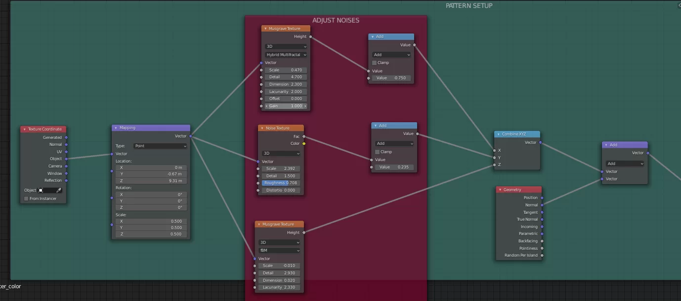
Step 3:
This time I added a regular noise and another musgrave texture with different scale settings. I combined all three noises with a combined XYZ node. I then took the output of the combined XYZ node and added it to the normal channel of a geometry node. I then took the output of the add node and connected it to the normal input of my material.

Step 4:
Now I was getting some very nice complexity, the edges started to feel like watercolor and to be honest, I probably could have left it at that but I wanted to try using fresnel as a way to add a darker outline, so I connected my normal map into a layer weight node and then I used the fresnel output of the layer weight node and connected that into a color ramp. Now I just had to adjust the blend value in the layer weight node and the color ramp until I arrived at something that I liked.
Using the Fresnel actually gave me a nice separation of the door and some other elements, as well, which I quite liked so I decided to add this as a multiply on top of my previous shader setup.
You can see the fresnel effect in the screenshot on the right.
Step 5:
As a final step, I connected my shader tree to an emission shader and that was pretty much my shader setup. At this point, I just continued to play around with my noise settings and my color ramp settings until I got something I was happy with.
The shader in itself was not very difficult to set up but it did take some time to arrive at the right settings that gave me the desired result. If you’re trying to create this material for one of your scenes, don’t be discouraged if perhaps the values I used are not working for your scene. It does take some tweaking and experimenting. I recommend starting with the noises first and dialing those in and then going into your color ramp and adjusting the sliders there.
5:


Freestyle
The last thing I had to do was add the outline and I used Blender’s freestyle render engine for that. Freestyle is an edge/line-based non-photorealistic render engine. It relies on mesh data and Z-Depth information to create or draw lines on mesh edges. We can then further define the look of those lines to achieve a more artistic or technical look.
First I needed to enable Freestyle by checking the Freestyle checkbox in the Render Properties Tab. I set the Line Thickness Mode to Absolute and the line thickness to 1 px.
Then I went into the View Layer Properties Tab and further defined the look of my lines. I wanted a more hand-drawn, sketch-like look for my scene. To achieve that I needed to make a few changes to the alpha and thickness of my lines.

Step 1
First, I specified which edge types I wanted to create. The Edge Types I used were Silhouette, Border and Suggestive Contour. In the Line Style settings I chose sketchy as my chaining method.
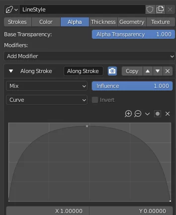
Step 2
Then I switched to the Alpha settings in my line style. I added an Along Stroke modifier and I used a curve as my mapping type.
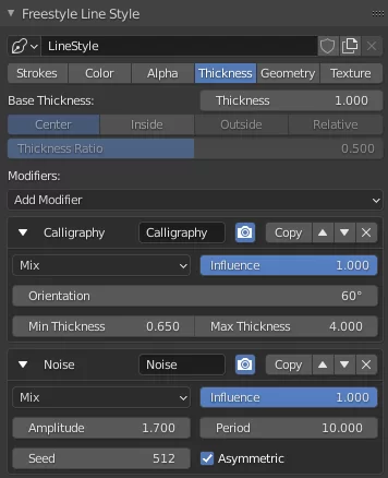
Step 3
The other changes I made were to the thickness of my Line Style. I added a calligraphy modifier first and then a noise modifier. Then it really just came down to trying out different values until I was happy with the final look.
At this point my scene was set up and it was time to hit F12 and check out the final result. And that’s pretty much it – I hope you found this tutorial useful and see you next time.
